HUB Style Guide
This guide will help you understand the HUB brand look, feel and voice.
Avoiding barriers to our readers fully understanding the message we want to convey, means that certain rules, according to the HUB personality, need to be obeyed!
Capitalisation needs to be consistent to avoid emphasis being put on the wrong words resulting in jerky reading and shouty bits. We stick to two main types of capitalisation which are title and sentence case.
Sentence case
- Capitalise only the first letter of the phrase or sentence
- Capitalise any proper nouns
Examples
- Streamline admissions, recruit more pupils and increase revenue
- Achieve a full school at Camelot College
- Benefits to your school
Other uses
- Field titles, Links, Radio button options, Tickbox options, Section headings, Explanatory text
Title case
- Capitalise all words four letters or longer
- Don’t capitalise articles, conjunctions or prepositions such as ‘a’, ‘an’ ‘the’ ‘with’ ‘because’ unless it’s the first word
- Always capitalise the first and last word
Examples:
- Next Generation Cloud Native MIS
- Set a New Task
- Application and Support
Other uses:
- Titles of Pages, Titles of pop up Windows, Button names, Titles of Guides, Documents or Presentations
Check HUB vocabulary to find out how to capitalise our HUB product names
Our colour palette
HUBmis uses colours purposefully to communicate how things function in the interface. We aim to balance the resting state of the application using neutral colours, against the high emphasis colours restricted to temporal communications of warnings and successes. We’ve used a monochromatic approach of a single blue colour, predominantly reserved for clickable interactive objects only.
The product uses colour entirely based on psychological research in colour theory and it’s a BIG subject. In short, blue incites the optimal arousal in the visual cortex and is thus reserved for items that are clickable.
In summary, colour is a powerful tool in presenting a UI. With a highly complex feature-rich educational MIS we control the use of colour in a highly disciplined and meaningful way. This structured approach creates visual patterns that can make interacting with our product easier to use and more predictable for users.
Primary
Secondary
HUB Blue
#33AACD
R51 G170 B205
HUB blue darkest
#2C343D
R44 G52 B61
HUB blue hover
#EBF7FA
R235 G247 B250
HUB blue darker
#424C58
R66 G76 B88
Neutral
HUB Black
#000000
R0 G0 B0
HUB White
#ffffff
R255 G255 B255
HUB Grey border
#d7d7d7
R215 G215 B215
HUB Grey
#f0f0f0
R240 G240 B240
HUB Grey panel
#fbfbfb
R251 G251 B251
HUB Grey icon
#6d6d6d
R109 G109 B109
HUB Dark grey
#95999e
R149 G153 B158
HUB gradient dark
#1d6e9e
R29 G110 B158
HUB gradient light
#3bbee5
R059 G190 B229
Our products have been constantly evolving. But the speed at which we evolve has been accelerating exponentially in more recent years bringing the investment and disruption, experienced in other sectors, to EdTech, and more specifically, to fulfil the needs of Independent and International Schools.
We have been investing millions of pounds into our product set. HUBmis, the first in the HUB suite was launched in 2020, swiftly followed by HUBadmissions and now we are awaiting the exciting development in our other core area with HUBincome.
Our Vision
Independent schools worldwide using WCBS systems to successfully access, record, manage and communicate information throughout the school community.
Our Mission
To support schools in delivering outstanding education as the leading supplier of world-class admissions, academic, administration and finance solutions.
Formatting plays a vital role in keeping a consistent appearance as well as making a chunk of words easier to read and understand.
It makes life so much easier when there is a guide to how our communication is formatted, rather than have to think how to do it each time.
Headings and subheadings
Separating different sections helps the reader to get an overall view while skimming, and to not be overwhelmed by a large piece of information, but don’t add too many in a row with only a bit of text between.
Links
These help accessibility and screen readers and should be incorporated into the text. Where possible, don’t use ‘click here’ or ‘refer to this document’, and instead incorporate the link name into the sentence.
Underline or italicise
Don’t. Especially not headings. It does NOT make them stand out more, and can actually make text harder to read.
Bullet points
Breaking up large blocks of text makes it easier to read and helps highlight specific items in a list for the user.
When using bulleted lists, follow these rules:
- Use bulleted (unordered) lists or steps instead of large blocks of text.
- Use parallel structure. This means each bullet should start with the same type of word (noun, verb) in the same tense and form, as with these bullets.
- Use a colon at the end of the text to introduce the bulleted list.
- Capitalise the first word of a bullet only if the bullet is a complete sentence or doesn’t have introductory text.
- Use a full stop at the end of items in the bullet list that are complete sentences.
- Keep the bulleted items of similar length and sentence style. If one bullet is a complete sentence, all of the rest should be as well.
Graphics play a very important role for us. Wherever possible we dedicate more space to graphics than words.
We include images of the HUB products wherever appropriate, select people who look like our customers and include EdTech graphics in almost everything we do, to ensure that the audience knows what we’re about.
Because we put so much importance on the graphics, special notice should be taken when positioning text and logos on top. If these elements have to be included, then you may need to reselect the images, or use a % transparency gradient overlay. Take note that creative cropping of the image could help – you don’t have to use it in its entirety!
Don’t forget to
- get permission from a school to use their photos
- check for licensing requirements if you download
- banish clip art from your HUB content files!
Contact us at Marketing@wcbs.co.uk for resources.
Examples:


")
HUB is the name of our overall product suite.
HUBmis® is a registered trademark and in documents where the logo is not being used, it should just have the registered trademark glyph the first time you use it. In Word and similar programs it will be found in insert > symbol. To get the symbol the right size, highlight ® then click on superscript icon.
For the rest of the communication, it should be written HUBmis, not Hub MIS, The Hub MIS, The HUB Mis or THE HUB MIS or any other way.
Don’t say HUB “miss”, say HUB “M.I.S.”
HUBadmissions, not Hub Admissions, the HUB Admissions, HUBADMISSIONS or any other ways.
HUBincome, not Hub Income, the Hub Income, HUBINCOME or any other ways.
Use ‘EdTech’ not ‘edtech’, ‘ed-tech’ or ‘Edutech’, cloud native not cloud-native.
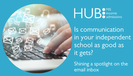
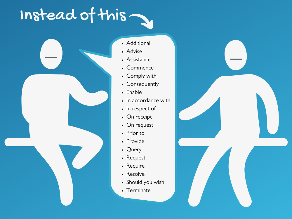
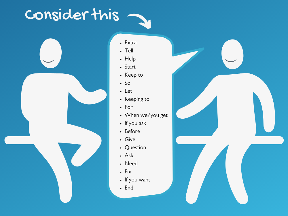
Use everyday English where possible, so you type how you would speak. We’ve picked out the examples below of everyday English, to get a bit more understanding.
We like using Icons, they can quickly show links and diversity within elements of HUB, and a lot of the time can say more than words.
These are used as standalones, or within circle elements, depending on the context and surroundings.


Group

Boy

Girl

Unisex

Staff

Straplines


The HUB family of logos is central to our brand and must feature clearly and prominently in all our communications.
The standard logos
These logos are our preferred choice when the intended background is suitable, such as white or light and uncluttered. All logos have a transparent background option.


Don’t :
- change the orientation of any logo.
- stretch or squeeze any logo.
- separate the words from the circles.
- reconfigure or change the size or placement of any logo elements.
- add any effects, such as bevel, emboss, glow, drop shadow.
- place any logo on a busy photograph or pattern or similarly coloured background.
- display any logo on “vibrating” coloured backgrounds.
- change any logo colours.
- outline any logo in any colour.
- put a white box around any logo.
- crop any logo in any way.
- present any logo in “outline only” fashion.
- recreate elements or replace with something else
Clear space should be all around the logos, of a size that would fit half of one of the circle elements.
Think about your audience
Think about your audience
Different school staff have different needs and levels of use for our products.
Use plain English
Use plain English
Communication should be easy to understand and jargon-free.Be honest
Be honest
Don’t over-promise or embellish our achievements, unfounded claims may not be legal.
Be engaging
Be engaging
Use the present tense and speak to our readers, not at them.
Be concise
Be concise
Make sure all information is useful, if you can cut out a word, then do so. Use ‘lets you use’ instead of ‘allows’ or ‘enables’ or ‘gives you the ability’.Talk in first and second person
Talk in first and second person
Use first-person plural ‘we’ and second person ‘you’ to speak directly to your audience and maintain a conversational tone.
Contractions
Contractions
Using contractions gives copy a personal and conversational tone. Contractions such as don’t and can’t are fine.
Numbers
Numbers
In the product, and when describing a measurement, always use the numeral. In copy, use numerals for double-digit numbers and larger.Latin terms
Latin terms
It’s best to use English terms to make sure everyone understands. ‘For example’ should be used instead of ‘i.e.’ or ‘e.g.’, ‘through’ or ‘using’ instead of ‘via’.
Abbreviations
Abbreviations
Think about your audience and if they will be familiar with a term. If they may not be familiar, in the first instance, follow with it spelt out in parentheses.Spelling
Spelling
Spelling mistakes can be distracting as well as wrong, and you can lose the very person who you want to read your message. Get your work read through as well as using Spell Check and Google.
Tables are very useful to display information about our products, so use them whenever you can.
A general style should be applied so that there is visual consistency across documents.
- Table body copy: 8/12pt, Automatic (Black) Arial Regular
- Table body copy alignment: Left, unless numbers, then right
- Header fill colour: #33aacd
- Column header: 8/12pt White Arial Bold centre align
- Row header: 8/12pt White Arial Bold left align
- Row height: Min. 10mm
- Outside border: 1pt Automatic (Black)
- Internal borders: 0.5pt Automatic (Black)

What we put on screen and paper are often our first chance to make a good impression, so it’s really important that people know what we stand for.
It’s important that every audience identifies with our style, so that as they move through different media, there is a friendly, consistent, clear and succinct message with all things HUB.
This includes campaigns, videos, emails, display materials, website, blogs, product information, release communications, technical and training materials. Plus, every chat they have with us and how we talk to each other on the inside.
Every word can go towards what people think of us, and we don’t want confusing, jargon-filled, badly thought out comms to impact that opinion.
We want the reader to find us approachable and understandable, and we take care to not be repetitive or complicated. We want to write how we speak so not in a formal way – read out loud what you’ve written!
But we don’t want you all to sound the same, just that you’re part of our family. You are, after all, here because you’re smart, caring, thoughtful people who want to help our customers and each other.
Our most common feedback mentions thoughtfulness, knowledgeable, helpful, understanding – so it does matter!
Knowledgeable yet functional
Knowledgeable yet functional
Confident in our expertise, but we explain in a way that’s helpful, understandable and clear. We are translators: demystifying tech-speak for educators.
Refreshing and positive
Refreshing and positive
Disrupting the sterile tone that’s so often used in our industry. A breath of fresh air, we surprise and delight our customers with day-making thoughts.
We use four typefaces depending on the application.
Gil Sans MT Pro is what we use for our promotional collateral/campaigns.
- Medium for Headings
- Book or Light 12pt for body copy.
Gochi Hand is for special comments, and generally it is not included as a standard typeface.
Gil Sans MT Pro is not included as a standard typeface in most programs, so our colleagues use Arial for all their documentation and we have Word templates set up with the various fonts, such as
- Heading 1 Arial 16pt colour Pantone 433 RGB 29, 37, 44; single line 6pt after paragraph #1D252C
- Heading 2 Arial 12pt colour Pantone 431 RGB 91, 103, 112; 12pt before paragraph #5B6770
- Heading 3 Arial 10pt colour RGB 85, 85, 86; 12pt before paragraph #555556
The web font we use is Roboto.
Setting and justification:
type should be ranged left with a ragged right hand margin.
Leading:
vary for each type style, depending on weight as well as case. In most cases, we can rely on the default. At larger sizes, leading may be reduced; ensure that ascenders and descenders never touch. Space between headings and body copy should be set on a case-by-case basis. Sizes of text of different typefaces can vary, such as with Gil Sans MT Pro and Gochi. A starting point should be half a line of body copy so ascenders and descenders are kept apart.
Tracking and kerning:
for body copy always set to “Optical”. When used at larger sizes kerning should be reduced, and in particular if using an all-cap headline, individual kerning of letters will be required.

")
")
")