Oli Truckle has worked as a Senior UX/UI Designer & Analyst at WCBS for almost four years. In this Q&A blog, Oli gives a unique insight into the design process of HUBmis, as well as the psychology behind creating an intuitive MIS product.
What were the main design considerations for HUBmis?
My background is actually in psychology rather than design which makes me an “experience” designer; where user experience (UX) dominates every user interface (UI) decision made in the product design. Our company has been in the education sector for more than 35 years so we have a pretty good idea of what requirements an education MIS needs. And most importantly we know to continually work with schools which use our products to check what we know. The same goes for our design process. Every feature a school needs to help solve its needs is always taken from the perspective of the user who has to complete the task.
The bottom line is to create a product that is intuitive to use, attractive to use, and is quick to use, so administrative staff can achieve more, and teachers are less bogged down in administration and have more time to focus on teaching.
What makes a design intuitive?
Designing an intuitive product means creating a predictable product. This means tasks are completed more quickly and with less effort by users. For example, pages are organised in consistent ways following strict patterns. This allows the user to become rapidly familiar with how the MIS works, regardless of the data they are working with.
How important was it to create an attractive interface?
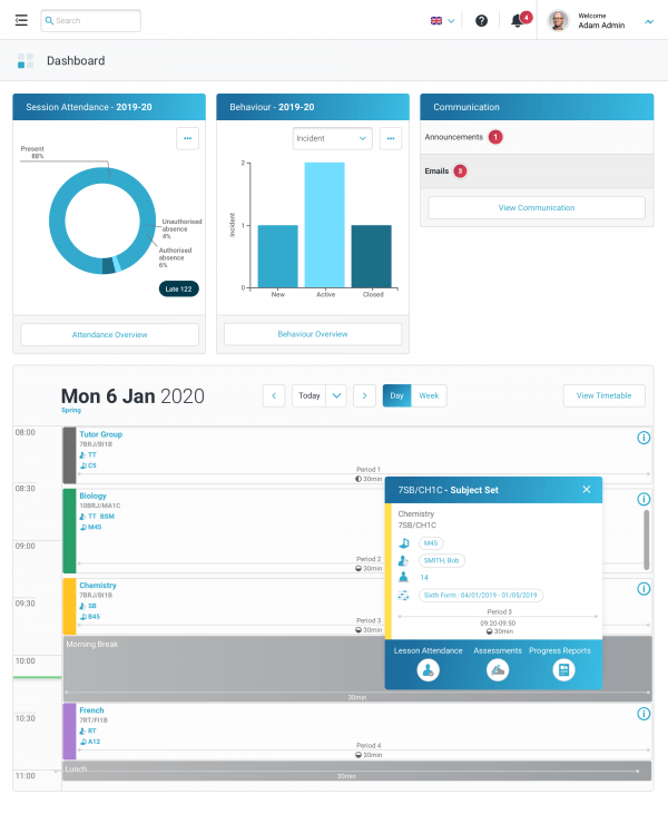
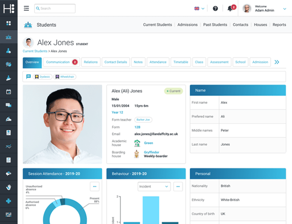
An attractive design makes users more patient and tolerant, and when it comes to common MIS tasks such as “data entry” – tasks that invariably cause impatience and frustration – that’s crucial. Users required to use the same product all day every day will appreciate a sympathetically designed product; one that doesn’t shout and provide unnecessary visual noise. We try to work on a less-is-more principle, with an uncluttered UI, only showing information that is relevant to the task in hand.
What makes a quick design, and was it a consideration for HUBmis?

Everyone wants a quick and responsive product, and technically we can do that. But in design we mean the speed that a user can grasp what to do in the UI, the speed they can identify the elements relevant to their task, and finally, the speed the users’ interactions with the software can get the job done. To achieve this an understanding of the psychology of how users interact with software, and users own cognitive limitations, needs to be understood.
What was the reasoning behind the colour palette; are there any benefits of using blue?
HUBmis uses colours purposefully to communicate how things function in the interface. We aim to balance the resting state of the application using neutral colours, against the high emphasis colours restricted to temporal communications of warnings and successes. We’ve used a monochromatic approach of a single blue colour, predominantly reserved for clickable interactive objects only.
So if it’s blue I can click on it?
Yes!
Why blue, not red?
The product uses colour entirely based on psychological research in colour theory and it’s a BIG subject. In short, blue incites the optimal arousal in the visual cortex and is thus reserved for items that are clickable. Colours with innate connotations of red for error, orange for a warning, and green for success are carefully reserved for these functions to allow them to stand out. Other colours used to categorise objects (e.g. in charts) are then carefully selected for maximum contrast, with an understanding of potential colour impairments (colour blindness etc) that viewers may have.
In summary, colour is a powerful tool in presenting a UI. With a highly complex feature-rich educational MIS we control the use of colour in a highly disciplined and meaningful way. This structured approach creates visual patterns that can make interacting with our product easier to use and more predictable for users.
We know how user-friendly HUBmis is, are there any design trends that were followed?
Rather than blindly follow trends, I look at what research tells us in making design-based decisions. This means colour choices are selected on users’ innate connotations. It means typography choice is based on its optimisation for readability, adaptability to different scales and weights, and thorough research and explicit documentation e.g. Google Material Design. Large scale design trends are never a simple fix, with typically pros and cons in all of them. Let’s take a quick look at the two big ones, where the design world continually waivers between Skeuomorphism & Flat Design.

Skeuo what?!
Skeuomorphism (in graphical UI design) describes interface objects that mimic their real-world counterparts in how they appear and/or how the user can interact with them. A well-known example is the recycle bin icon used for deleting content. Skeuomorphism makes interface objects familiar to users by using concepts they recognise. Skeuomorphism represents affordances in digital user interfaces. It fits with our natural interpretation of objects in the digital world.
Skeuomorphism is related to what the psychologist James Gibson termed “affordances”. Affordances refer to action possibilities of objects or other features of the environment. The most commonly cited examples of affordances include door handles and push buttons; their physical designs inform users that they can be rotated or pushed.
Affordances are a key concept for designers. To build products that are intuitive and easy to use, fully understanding the relationship between the human mind and technology is crucial.It has been widely debated, however, whether users have become so accustomed to interacting with graphical user interfaces that skeuomorphism is no longer necessary. UIs that contain natural-looking objects can make an interface look cluttered, may not scale well to small sizes, and some objects mimicked in skeuomorphism have become obsolete and meaningless to users (e.g., the floppy disk for the “Save” action). Proponents, on the other hand, argue that humans can never become as accustomed to the digital world as we are to the physical world—so, simple skeuomorphism will continue to be helpful.
So what’s flat design?
Flat design is a UI design style that uses simple, two-dimensional elements and a restricted colour palette. Gone is the illusion of 3D representations of physical buttons. Its popularity became prominent with Windows 8, Apple’s iOS 7, and Google’s Material Design. With the use of simple shapes and minimal textures, flat design ensures that responsive designs work well on the whole range of digital devices (from desktop to mobile).
So flat design wins?
Not so fast! Recent developments of widely used UIs like Apple’s revised operating system (macOS Big Sur, Autumn Release 2020) mark a return to skeuomorphism, and away from symbolic flat design. But closer inspection reveals the search for a balance between approaches. Iconography, in particular, has retained a simplified set of elements (reminiscent of flat design) whilst using a consistent use of shadow and gradient to increase affordance.
And the short answer?
HUBmis is most heavily influenced by flat design because the MIS is a feature-rich environment, often demanding a range of complex interfaces to aid task completions e.g. timetabling classes. The emphasis must, therefore, focus on an uncluttered UI naturally found through flat design, with skeuomorphic concepts used only sparingly.
As a UX/UI Designer, how does HUBmis’ interface stand out from its competitors?
The joy of working on HUBmis is that we’ve been able to start from scratch. We’ve had a blank canvas to look at everything a modern SaaS product running an educational MIS needs. The latest technical frameworks such as CSS Grid allow the very best modern drag-and-drop interfaces to be designed and applied where needed. The very latest psychological research allows the new world of UX to dominate every decision we make, to ensure that the product works like a dream for the user, as well as providing the wealth of product features that our 35 years in the education sector allow us to deploy.


